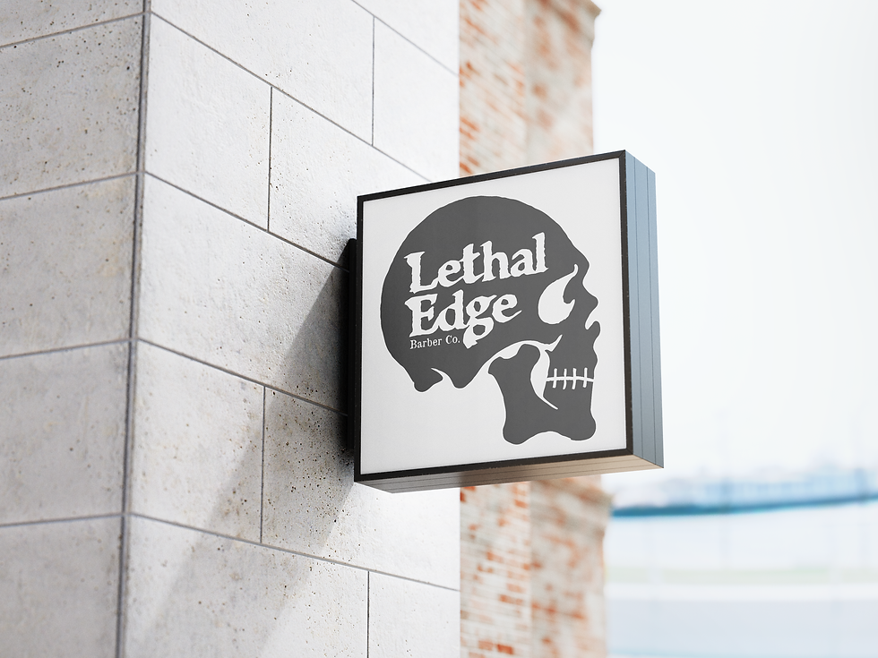


Lethal Edge Barber Co.
Primary Mark of Identity and Collateral
The client wanted an identity that not only felt in-line with businesses such as Liquid Death, and SLC's Heavy Metal Shop, but also wanted it to speak toward the apothecary aesthetic of her workspace. She wanted something the would lend itself to merchandising, so I opted for a single color solution, as that would be the most cost-effective.
The next challenge was the business cards, which also needed a similar level of edge and to reassert the aforementioned apothecary look that she was looking for. I felt like a mortuary toe tag was a playful way to get that edge, with the client's contact info filling out the card. I also made a point for the hole on these cards to be precisely in scale with a standard hole punch in order to provide the option to loop string through them for added effect when desired.